Hooray!
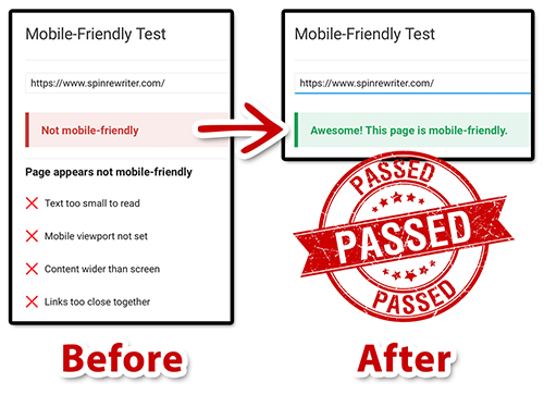
The mobile version of the official Spin Rewriter website now passes all tests when it comes to delivering a truly great user experience on mobile devices with small screens.
You've seen some of the changes that we've recently rolled out in my previous post on mobile responsiveness, and today I'd like to share this with you:
 Spin Rewriter - Mobile User Experience
The result of the test above means that our website now passes all challenges that stood in our way on the path to a truly great mobile user experience. From large and friendly texts, generous whitespace, larger targets for links and buttons... which also includes a completely redesigned header and footer of the website... all the way to mobile-optimized images and so on and so forth.
Thanks to everyone on the team who had a hand in delivering these updates, and we couldn't be more excited about it all! 😃 Hope you like it!
The mobile version of the official Spin Rewriter website now passes all tests when it comes to delivering a truly great user experience on mobile devices with small screens.
You've seen some of the changes that we've recently rolled out in my previous post on mobile responsiveness, and today I'd like to share this with you:
 Spin Rewriter - Mobile User Experience
The result of the test above means that our website now passes all challenges that stood in our way on the path to a truly great mobile user experience. From large and friendly texts, generous whitespace, larger targets for links and buttons... which also includes a completely redesigned header and footer of the website... all the way to mobile-optimized images and so on and so forth.
Thanks to everyone on the team who had a hand in delivering these updates, and we couldn't be more excited about it all! 😃 Hope you like it!
Published on: October 2nd, 2016
← Previous: Spin Rewriter - Mobile Beta
→ Next: A little birdy just told me...


